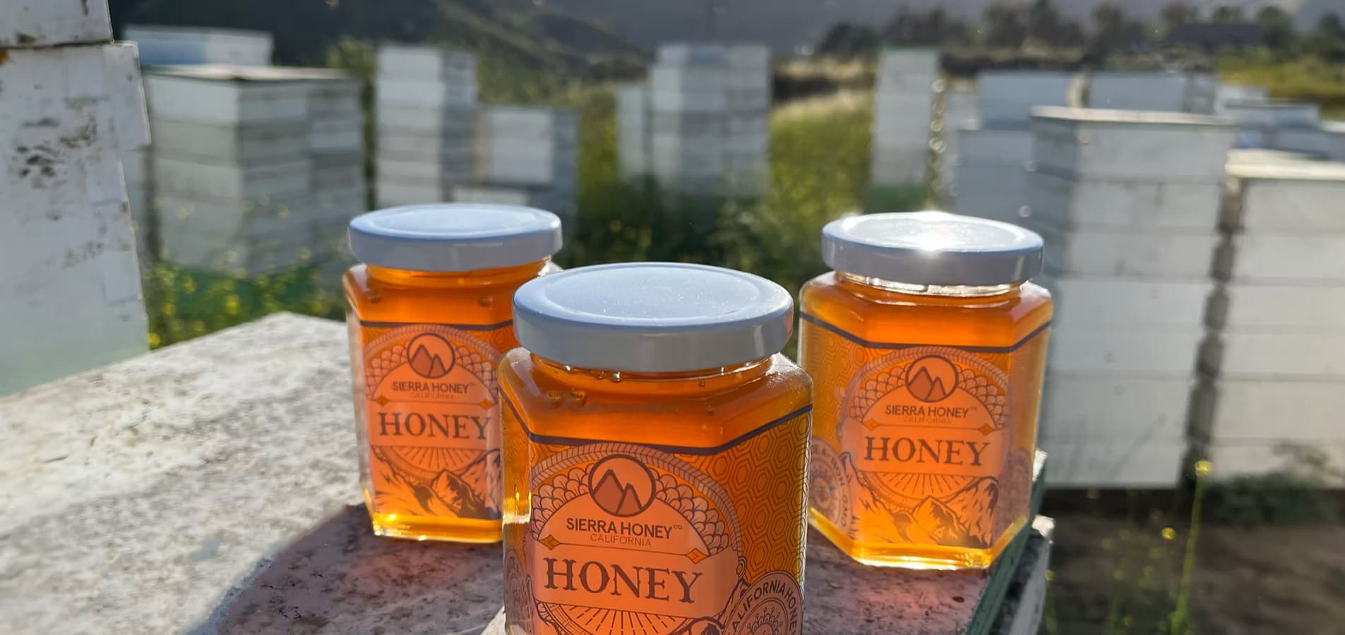
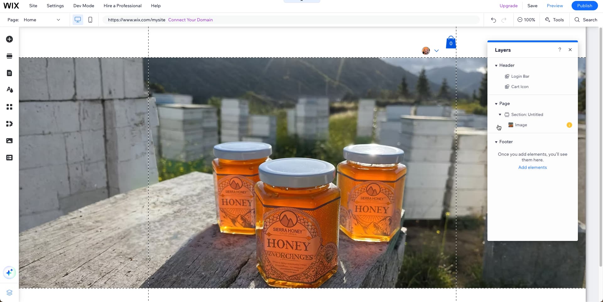
I’m having trouble with the difference between the main page background photo strip between desktop and iPhone safari sites…extending vertically for the photo in editor helps with desktop version but doesn’t work with iPhone safari version.. here is the link sierrahoney.com.. the photos of each are attached below. Would like the desktop version to show like the iPhone safari version does i.e. more sky and bottles in frame…. Thanks! 


This is caused by the image’s scaling proportions and with the mobile version being taller rather than as wide as the desktop version. This feels similar to this feature request.
This article helps a bit with settings for images on desktop and mobile sites but I would add images set to the proportions of each design. I had to use AI extend for the desktop version in the image above to get an idea.
And then I used the image you shared for mobile.

1 Like
Thanks for this! The AI image extend still didn’t do anything to remedy the desktop version of the photo. It is still scaled in way too close.