In Editor X, I am using the 3 default breakpoints for viewports:
1001 & up
751 to 1000
320 to 750
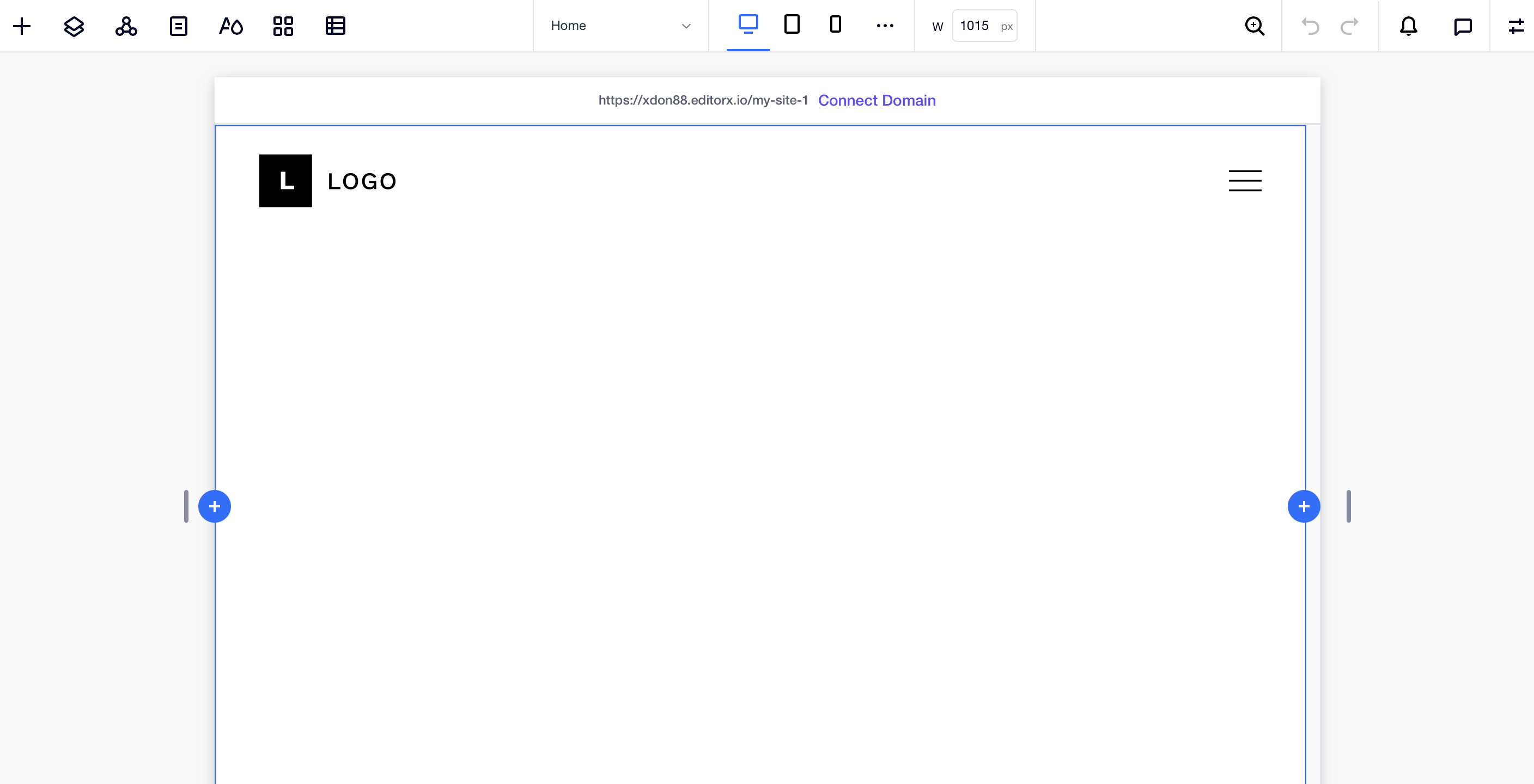
When I am shrinking the page with the resize handles and the handles reaching 1014px the look of my page ist shifting from “1001 & up”-breakpoint to the “751 to 1000”-breakpoint (for example the menu is disappearing and the hamburger menu pops up). But only the look is shifting and the button for the “1001 & up”-breakpoint stays selected in blue. The look of the grid is shifting from 2x1 to 1x2 but when I try to adjust the grid at 1014px, the2x1 option is still selected in the “Adjust Grid”-window. Why does the look of my page shift even I didn’t reach the breakpoint?
You will need to make sure, nothing is a fixed or something that exceeds the space allotted for it. What shifts? Take a before and after the shift screen shot to see if I can help.
The appearance of the homepage is shifting from the first picture to the second. Then it looks like it is in tablet mode but it’s not. In tablet mode I set the grid layout to 1x2 but you can see in the image below that it is still on 2x1. Therefore I can’t adjust the position for example of the title/text because it would change the position in the first picture too. And today I recognized that some how this is only happening on my imac and not on my macbook.
In the layers select the PAGE, then click on the three dots and show me your break point list
THEN
In the layers select the image or gallery, which ever is hosting the photo itself, then click on the three dots and show me your break point list
Some where on your page an element is being assigned a different breakpoint. Your page follows the break points where your menu changes as you enter the tablet. However, one your elements is entering the mobile layer sooner (or simply at the wrong time.)
I once had 5 break points for a container that had a very fussy design, while the site general break points remained at a default.
I think I am understanding what you mean, but somehow this problem doesn’t occur on my laptop (mac book). But if this occurs on my iMac it can happen for other people too.
I am not getting that error. But again, you can select the menu item in this case and change it’s own break points that are separate from the page’s break points.
Here is my proof of the of the 1015 break point issue not happening. I am thinking it may be a screen resolution issue or something that is different?
I am doing a very creative site right now and I must have 6 sets of varying break point, some having 5 break point view ports. Crazy fun, but yeah it is work.