In Editor x preview, all works fine. However, when published, even just a simple black background with nothing else. If you drag the page down near the top, it reveals a white at the very top of the page until you release the drag when it snaps back. It does the same on the bottom if you drag it up.
At first, I thought it was something all sites on mobile devices effects. After looking more, only editor x version published sites do this on mobile. Other websites do not, such as BBC player etc.?
iOS devices. I tested it on the iPhone pro-Max 13 iOS Version 15.4
To recreate: - No headers or footer, just a plain black colour, nothing else; you will see the effect on a mobile device when published. Press and hold the screen; drag it down near the top. The white will display.
Can it be stopped, even just changing the revealing white to a colour to minimise it?
If no one knows the reason and has a published mobile site completed with Editor x, could you please check if it does the same effect that way, I will stop looking to solve the problem?
Hey @coz , thanks for the step to replicate as I was able to test out the example and compare it to the BBC player page.
Since none of the android devices I tested had this function of being to drag the page and reveal any info, I assume this is referencing iOS devices. If so, the white that is being shown is the Website Color Theme and can be customized with the use of a metatag. The format would be as follows:
[replace #000000 with theHex codeof the color you want]
Thank you for the detailed reply, which was easy to follow and made sense. However,
neither of the methods did anything. There was no colour change. It still scrolls down white.
Yes, it was on iOS devices. I tested it on the iPhone pro-Max 13 iOS Version 15.4
……was the colour I used.
I can see the logic, and I felt it should have worked.
I appreciate the time you took to try and help me. Any other ideas why it may not have worked?
@coz No worries about the time taken. I don’t know if I have another workaround. I can try to look but that’s strange as it works on my end for the device. Only caveat it’s not running Safari 15.4.
I used the page method since this test site doesn’t have a domain associated with it.
Do you have a link to the site? The source code can be checked to see if the meta tag is in the site code. The code you entered above looks good and don’t see any extra or missing attributes but might want to double-check it was entered just in case.
@Rob , I was able to apply the meta tag but it didn’t change anything. There are still giant white bars below the footer on desktop, and also on the sides when my iPhone 11 is in landscape mode.
Glad you were able to add the meta tag and was able to get the same thing on landscape for iPhone specifically and not on Android. Might be the way iPhone renders landscape but will try to get more info.
Was able to find some fixes @buckbowen . So for the gaps, seems iOS adds it on landscape so content does not get cut off due to the notch on the phone where the camera and other sensors are. You can set the page to occupy the entire viewport width with a meta tag
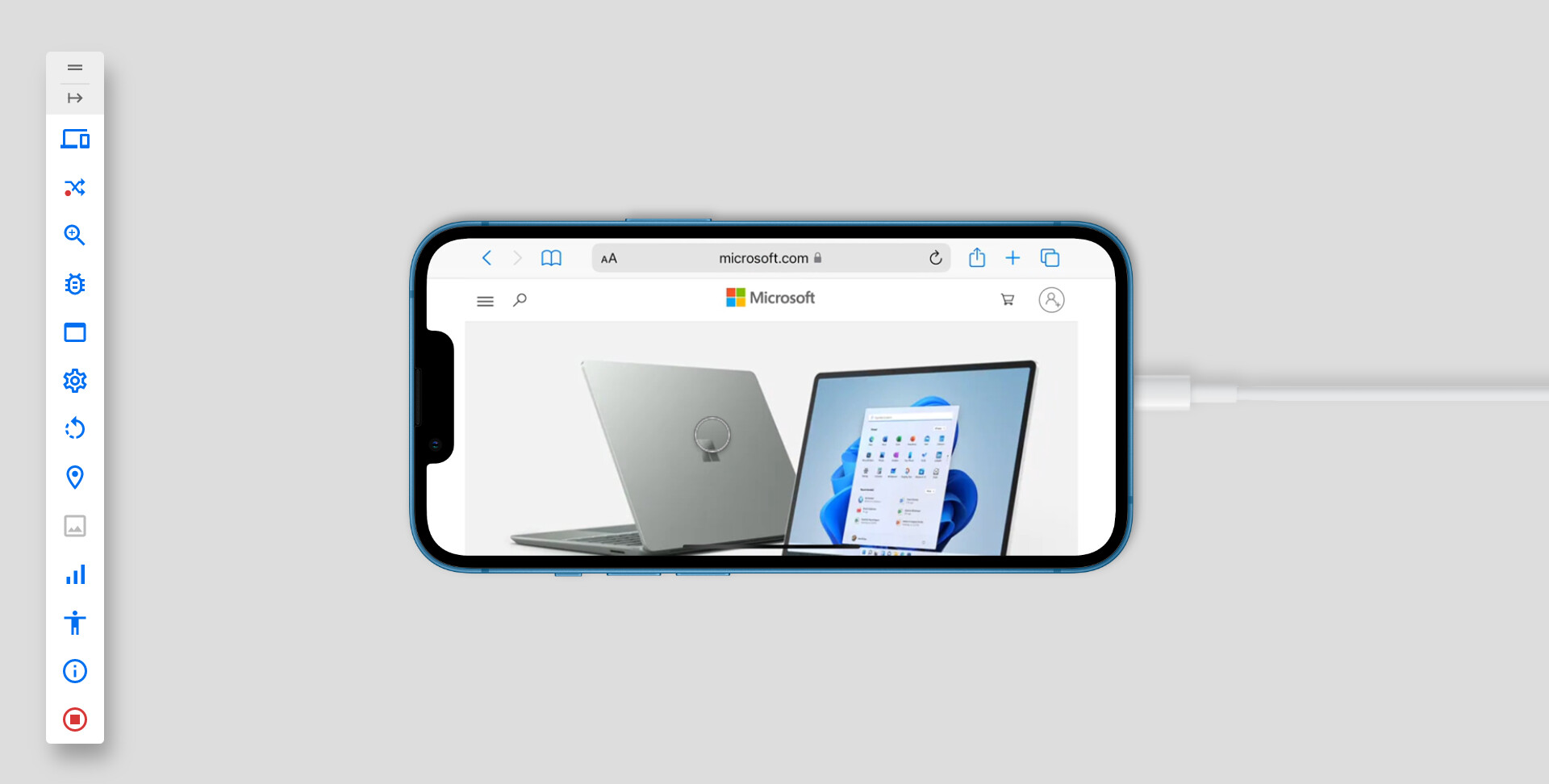
Note that this pushes the page to be behind the notch so if there’s relevant content close the left or right-side of the screen, it may be hidden behind the notch. Again, it’s how iOS renders the devices so not much Editor X can control. Microsoft.com has their page to render normally.
However, almost everything was working for me on tablet, mobile and desktop and made a video of it below.
Only thing I can’t see is the landscape version of the phone not showing the theme color but I think that may be due to setting for the phone that I can’t access with my current setup. It could be Allow Window Tinting in the iPhone settings if you want to try.
Though again, if that does change it, then the experience will be different for each user that does or does not have the setting enabled. It wouldn’t be a universal toggle you can setup.
Thank you so much for all this precious information Rob. I’ve been looking for this solution for a long time super glad to finally found some good information.
I just have one question. Is it possible to fix a the theme colour specifically for one page of our website and let the rest in a different colour ? I have a full video background video page and would love to have black but for the reste of my website white is perfect.
If you know a trick would be super grateful.
Once again thank you so much for all these precious informations
Nath
Finally found a solution going through - manage.wix.com - Settings - Custom Code - adding custom code - and selecting the pages I wanted in one colour and doing the same for all the other pages I wanted in an other colour it’s working great !
@user4910 I’ve been looking for a solution for this forever and have tried everything in this thread to no avail… what custom code did you add to the pages? Thanks so much!


