Question:
How do I fix elements to scale properly when browser size changes?
Product:
Wix Studio Editor
What are you trying to achieve:
It’s extremely frustrating when everything looks perfect on my desktop browser, but once I scale down to mobile — even using pixel-specific breakpoints — the layout completely falls apart. I’ve gone through all the breakpoints and tried scaling elements proportionally, but things still overlap or appear incorrectly.
Even when I view websites designed by Wix’s own graphic designers and resize the browser on my desktop, the elements become misaligned. Is this a limitation of Wix, or is there a straightforward fix I’m missing? It’s a bit discouraging to see that even experienced developers seem to struggle with getting responsive design right on this platform.
What have you already tried:
I’ve read articles and watched the Wix training videos.
Additional information:
I’ve learned the hard way the answer to this question… use anything except Wix Studio!
Use the CSS grids or layouts? Still goes to hades in a handbasket.
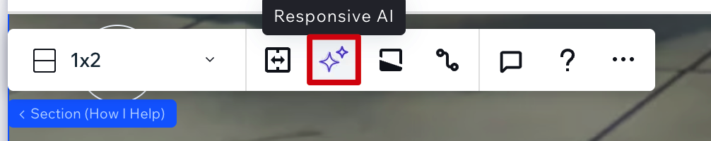
You can use their AI tool… It’s a 50/50 but that DOES help at times… you always need to tweak but try that. You have to do it for each section and its in the section hover tool bar.
But… you can get the mobile view all fixed and then… BOOM… it will do some crazy thing and change it all, decided to reorder your sections for no reason…
Wix Studio is still not, imo, even qualified as a Beta product… it’s like a bad Alpha that should not have ever seen the light of day.
Even using their own designed sections or grid layouts is a hot hot mess.
I end up hiding a lot of sections on mobile, and then rebuild them in the mobile breakpoint (time consuming affair that shouldn’t be… but it’s sometimes the ONLY solution).
And again, you’ll get it there - publish… and then… it changes itself for no reason.
I suspect using layout tools (like Stacks, repeaters, flexboxes, Section grids etc.) will help greatly with this
Can you share links to those sites? This shouldn’t be the case and I’d love for the team to take a look at what’s happening
This is a Wix Editor site - not a Studio site.
Wix sites are adaptive (have a min-width of 980px on desktop), whereas Studio sites are responsive and adjust according to the browser window size 
Ohh I’ll try the AI!
But I 100% agree. This is not it. lol We will change one word and then the whole mobile version messes up. I don’t understand AND don’t even get me started on embedded links in the mobile view. IT’S A MESS
Hi! How do i use advanced css grids?
What’s the difference between px and *px?
Got it.
To answer your other response, we do you section and repeaters.
Oh while I have you, is there any way to fix the embedded links on mobile? They don’t size down properly and look pretty bad.
I’m not sure I follow when you say “embedded links” - got a screenshot?
Sure!! I’m referring to adding the html code. The desktop view the link works fine but in the mobile view it doesn’t scale down small enough so it has the little scroll bar. I’ve attached a photo.
px means the size is fixed across breakpoints
px* is a fluid unit of measure in the Studio Editor. It lets you edit sizing using a familiar measurement (pixels), while the actual measurement behind the scenes is responsive.